Visualising Complexities and Relations
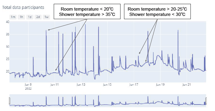
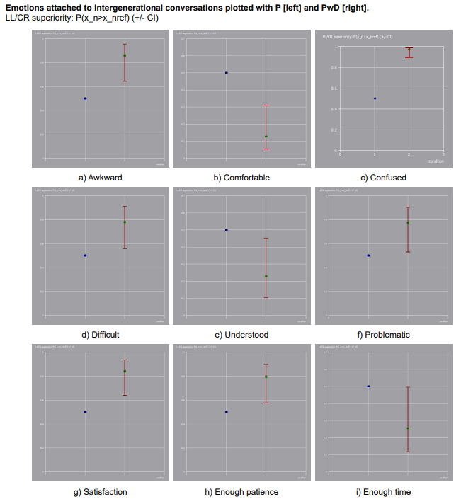
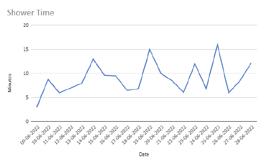
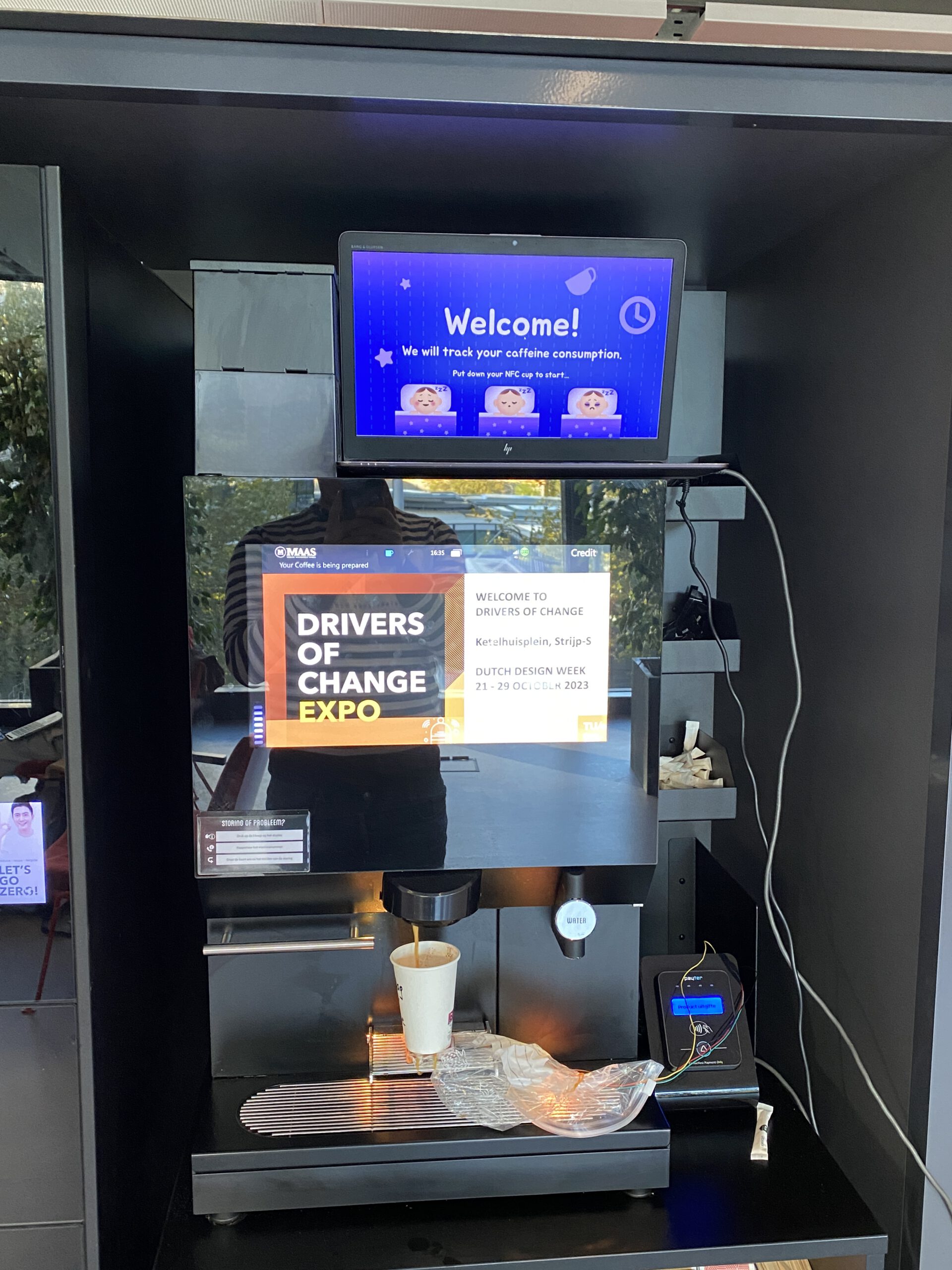
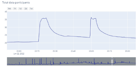
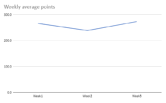
An area that did grow out to be more exciting throughout my Master's. I often struggled with the implementation of this area, as I tended to work mostly with qualitative data, in semi-structured interviewing. As my Master's projects did focus more on the development of products with communicative responses, with not as much emphasis on direct data feedback, I could use quantitative data analysis to strengthen the qualitative insights. These qualitative results would often be transcribed by hand and insights would be elicited from the responses to the questions asked. Especially in my M1.2 - A Tool to Involve, and M2.2 - Playful with Dementia, did a combination of qualitative and quantitative data insights help to support the findings. An explicit focus of Math, Data and Computing was more visible in the course 'Data-enabled Design', and helped to consider quantitative data analysis more exciting. Within this course I was able to translate temperature data and time towards useful insights in showering behaviour and provide the people showering with direct feedback on their performance of becoming more sustainably-aware of their actions (top three figures). Although the study would require a more elaborate study to conclude insights, the models made throughout the course could provide us with sufficient reasoning to irregularities and relationships in the data. Visualising the complexity of beforehandedly predicted simple shower data. The direct impact of user data was later on explored further in the project 'Design for Behaviour Change', as I programmed a system that would provide direct feedback on the caffeine consumption of a person ordering coffee.
Explicit implementation in FMP
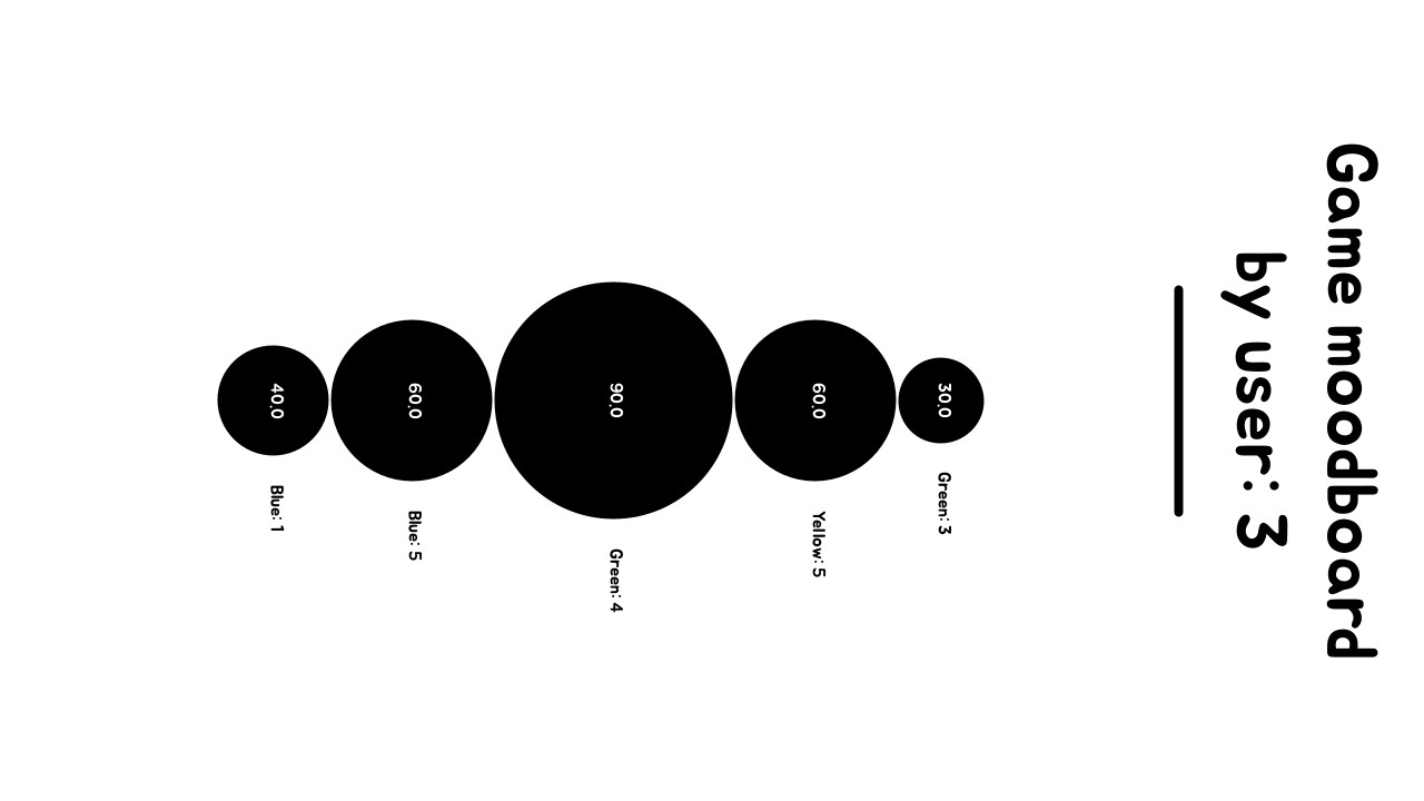
The tool Archiful presented a game in the moment, with the possibility to write down notes on the board. After the game, the users would be able to take a picture of these notes, but further recording was not implemented from the start. This is when it was considered to record the individual playback time and visualise this in a easy to read manner for users, experts and others involved with the product. As a means to see which sounds were liked, whether some were understood less well, or what the length of the topics written down was. A bubble chart visualisation was considered, as it would immediately highlight what the longest and shortest track was and how these compared to the other sounds (Bottom right figure).
